This is a self-initiated redesign of the Reliance Health landing page, focused on improving clarity, structure, and conversion. The original page looked good but didn't communicate value clearly or guide users effectively.
My goal was to make the experience more intentional — helping users understand the offering quickly and take action with confidence.
.png)
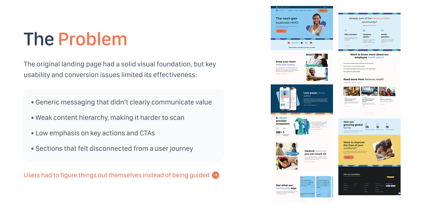
The original landing page had a solid visual foundation, but key usability and conversion issues limited its effectiveness:
- Generic messaging that didn't clearly communicate value
- Weak content hierarchy, making it harder to scan
- Low emphasis on key actions and CTAs
- Sections that felt disconnected from a user journey
Users had to figure things out themselves instead of being guided. The page described features but not outcomes.
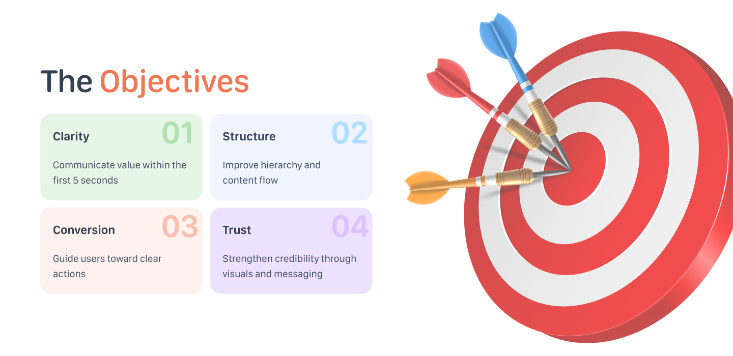
Four clear goals guided every design decision throughout the project:
- Clarity — Communicate value within the first 5 seconds
- Structure — Improve hierarchy and content flow
- Conversion — Guide users toward clear actions
- Trust — Strengthen credibility through visuals and messaging
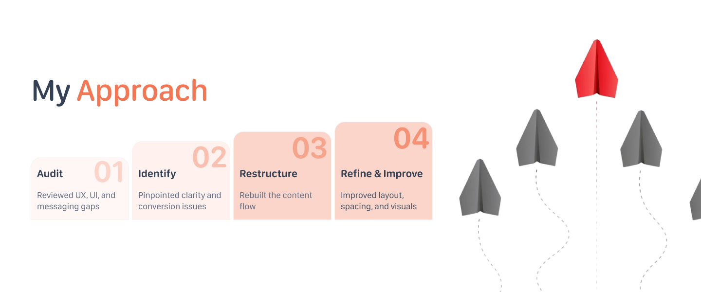
I followed a four-step process, moving from audit to delivery without over-engineering the brief:
- Audit — Reviewed UX, UI, and messaging gaps on the existing page
- Identify — Pinpointed clarity and conversion issues from a user lens
- Restructure — Rebuilt the content flow to match a logical user journey
- Refine & Improve — Improved layout, spacing, and visuals to align with brand
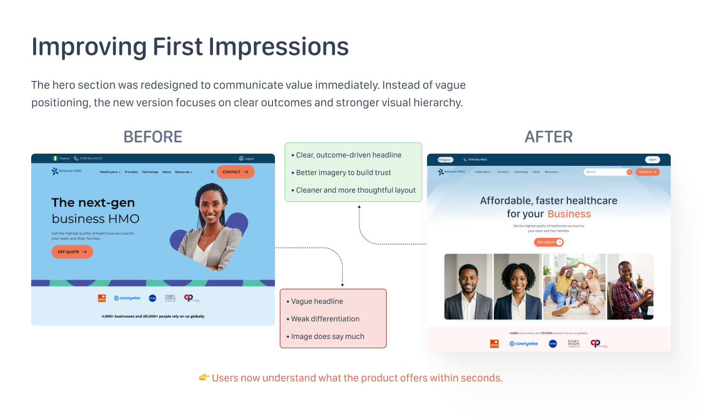
The hero section was redesigned to communicate value immediately. Instead of vague positioning, the new version focuses on clear outcomes and stronger visual hierarchy.
- Clear, outcome-driven headline: "Affordable, faster healthcare for your Business"
- Better imagery to build trust — real people rather than abstract shapes
- Cleaner and more thoughtful layout with a single primary CTA
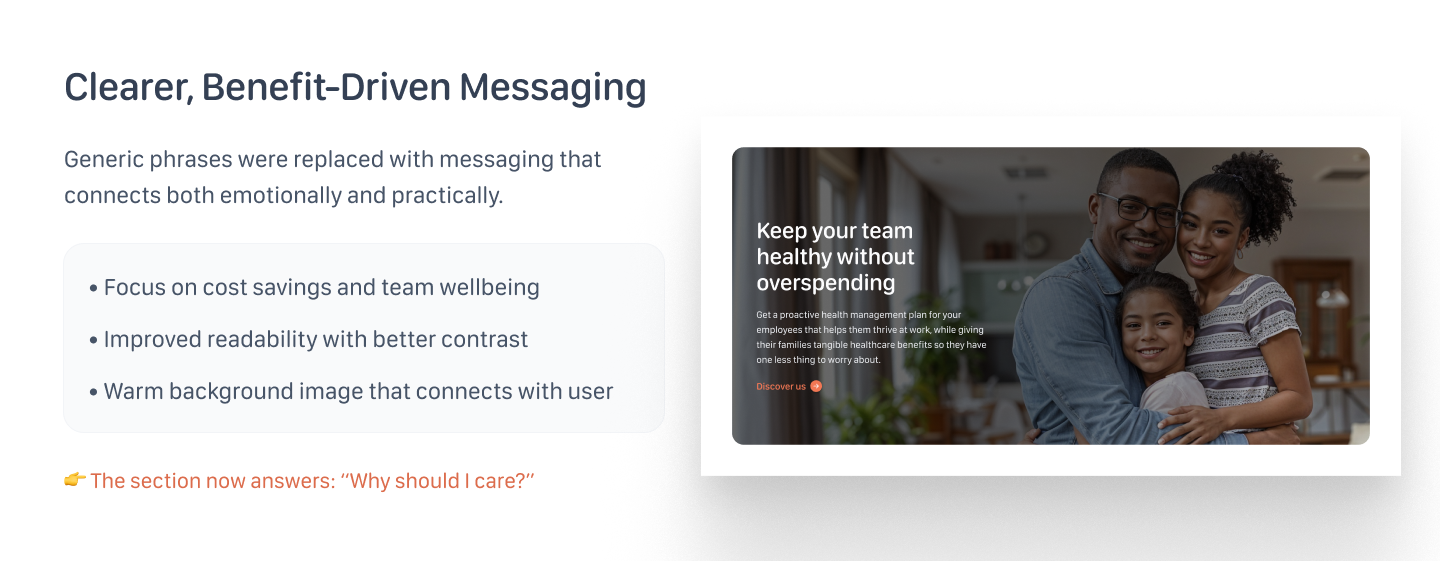
Generic phrases were replaced with messaging that connects both emotionally and practically. The section now answers: "Why should I care?"
- Focus on cost savings and team wellbeing
- Improved readability with better contrast
- Warm background image that connects with the user
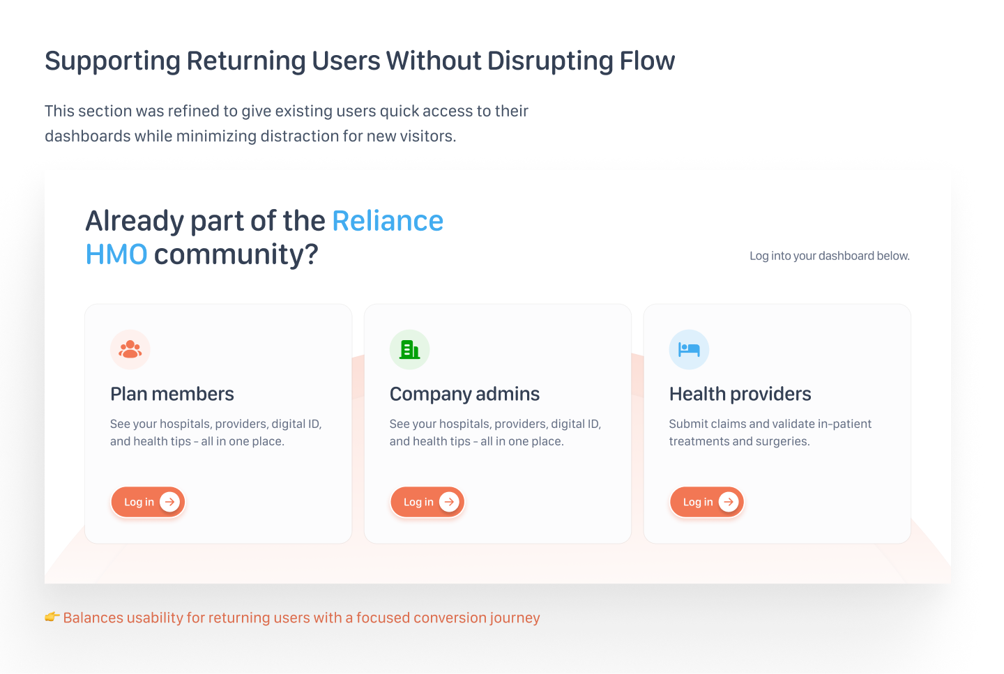
This section was refined to give existing users quick access to their dashboards while minimizing distraction for new visitors.
By surfacing three distinct login paths — Plan members, Company admins, and Health providers — returning users can navigate directly without wading through acquisition-focused content.
Balances usability for returning users with a focused conversion journey for new visitors — without forcing a binary choice.
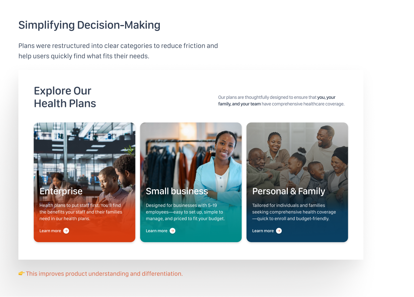
Plans were restructured into clear categories to reduce friction and help users quickly find what fits their needs. The redesigned section surfaces three plan types — Enterprise, Small Business, and Personal & Family — each with a distinct visual identity.
This improves product understanding and differentiation, reducing the time to decision.
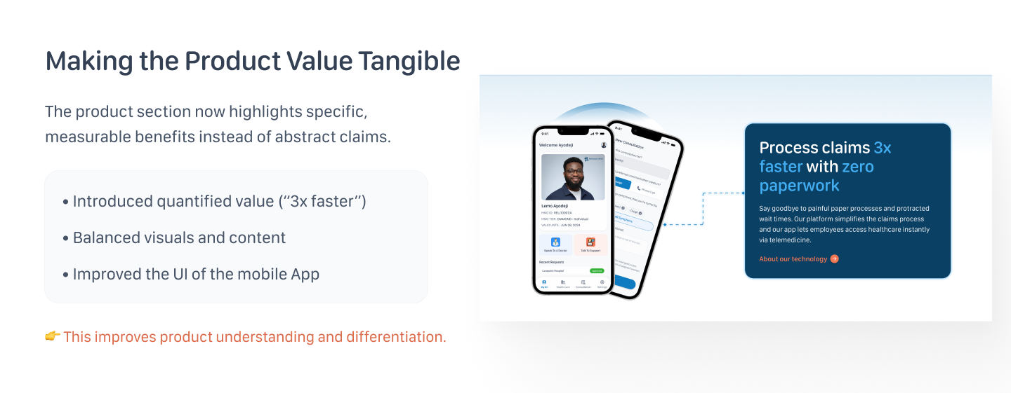
The product section now highlights specific, measurable benefits instead of abstract claims. Quantified value — like "Process claims 3x faster with zero paperwork" — makes the offering concrete.
- Introduced quantified value ("3x faster")
- Balanced visuals and content with app preview mockups
- Improved the UI of the mobile app display
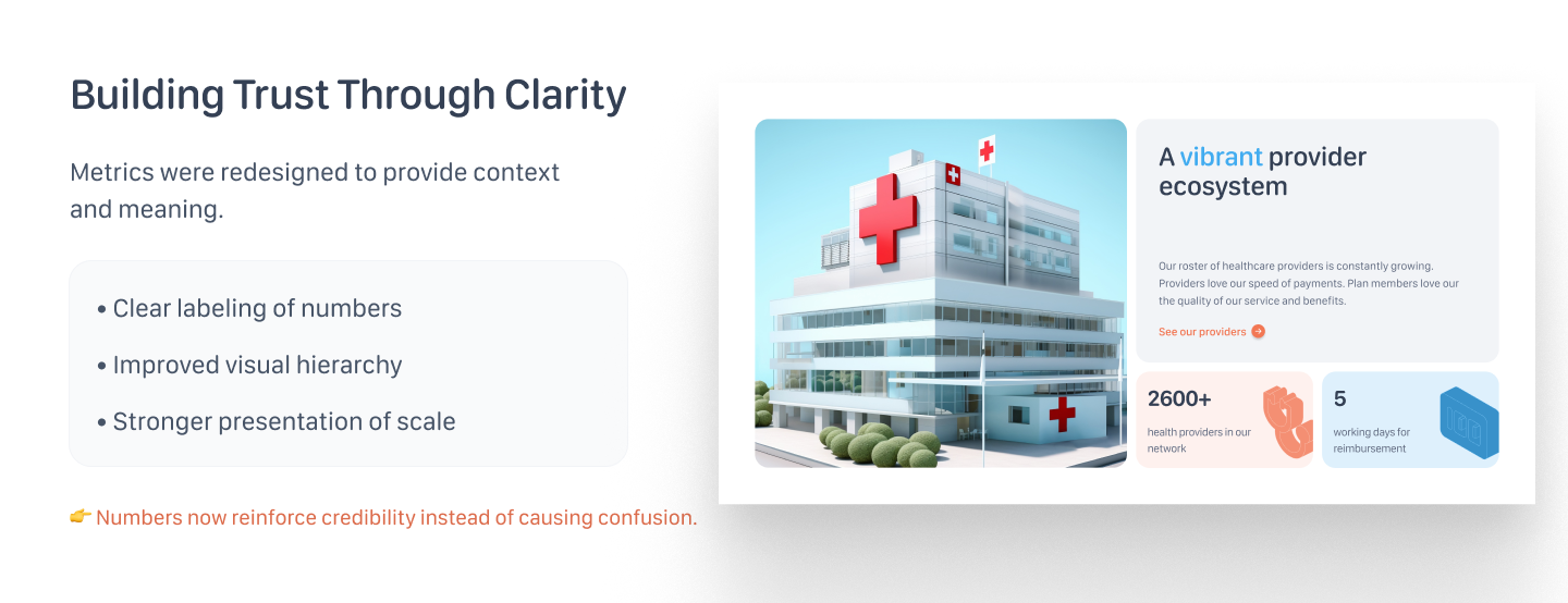
Metrics were redesigned to provide context and meaning. Raw numbers were replaced with clearly labelled stats that reinforce scale and credibility: 2,600+ health providers and 5-day reimbursement.
- Clear labeling of numbers so users understand significance
- Improved visual hierarchy for trust metrics
- Stronger presentation of provider network scale
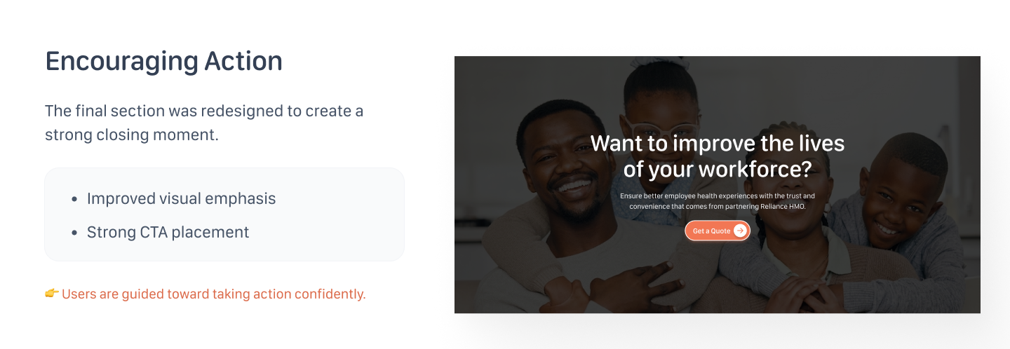
The final section was redesigned to create a strong closing moment. Rather than ending on a neutral note, the page now closes with a human, emotive image and a clear, direct CTA:
"Want to improve the lives of your workforce?"
- Improved visual emphasis with full-bleed photography
- Strong CTA placement above the fold of the section
The complete redesigned page, showing how all sections connect into a cohesive user journey from awareness to action.
This project reinforced how much messaging strategy matters in landing page design. The biggest unlock wasn't visual — it was reframing every section from feature-led to outcome-led.
The self-initiated nature of this project gave me freedom to push decisions further than a typical client brief allows. If taken to production, I'd want to validate the hero copy variants and plan comparison layout through A/B testing across different acquisition channels.